
COLOUR COLLECTION No.4
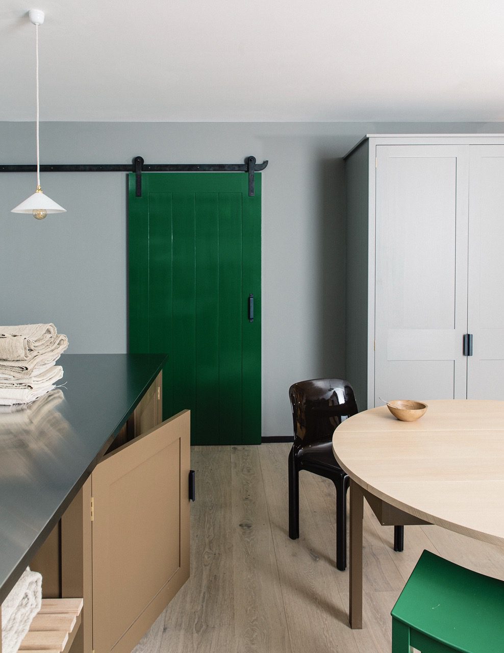
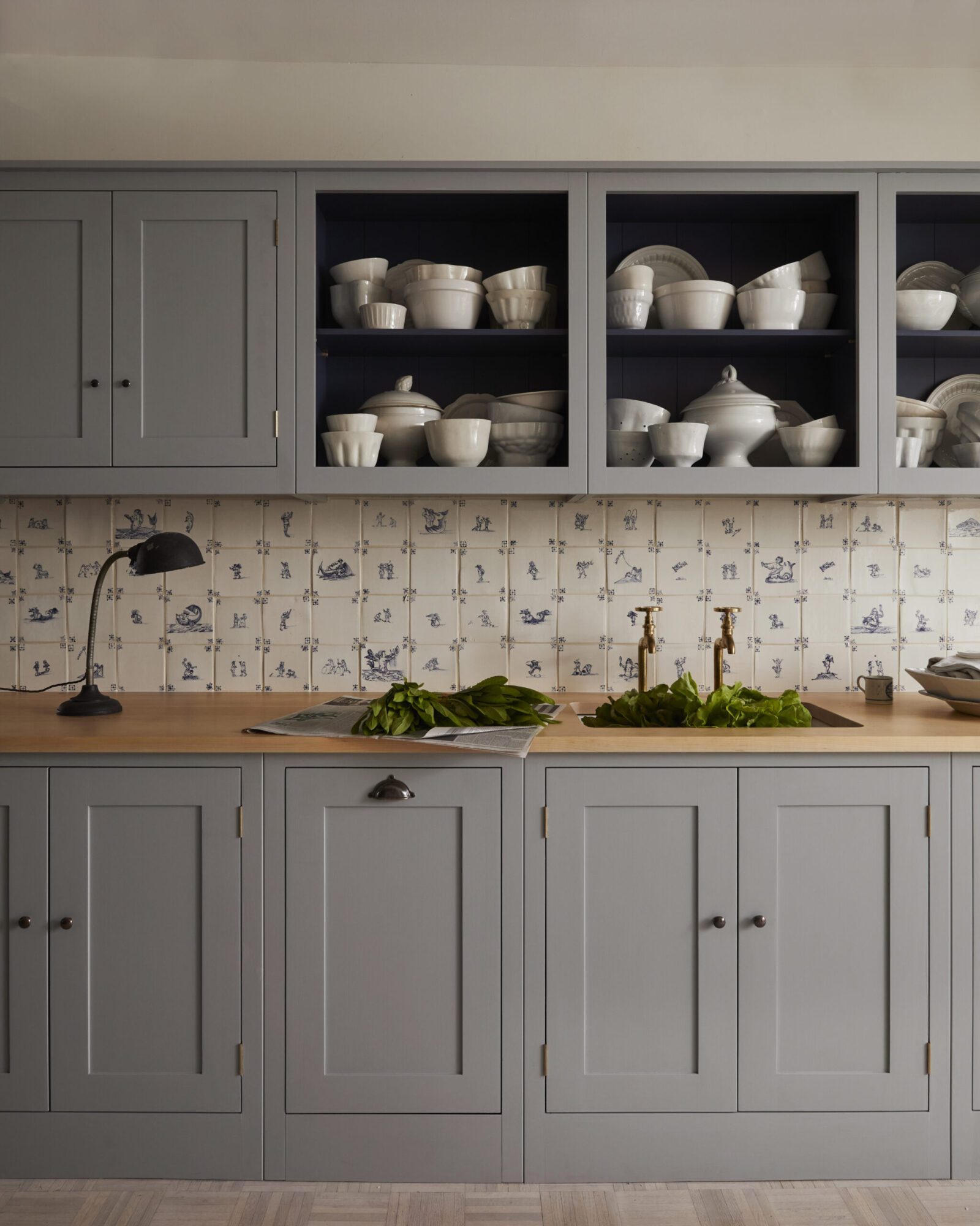
Celebrating THIRTY YEARS of Plain English, a simple collection of six new paint colours in ‘elemental’ shades, created and inspired by the materials traditionally dedicated to celebrate each anniversary year. The palette is based on paper, sugar, pottery, tin and linen with pearl being the most precious, honouring Plain English’s thirtieth year. Influenced by some of the more practical colours used in the vast working kitchens found in great houses and estates, which continue to embrace the thoughtful details we are known for. This collection was put together by Kate Shaw.
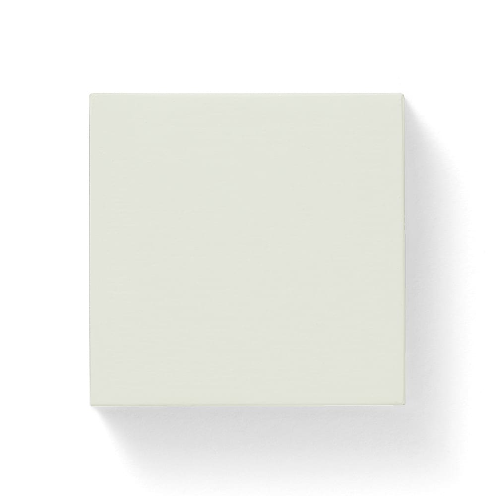
37. PAPER PARCEL
PAPER PARCEL is a creamy shade of ecru, tinged with green, drawn from the everyday pallor of a traditional ‘newsprint’ paper.
View examples
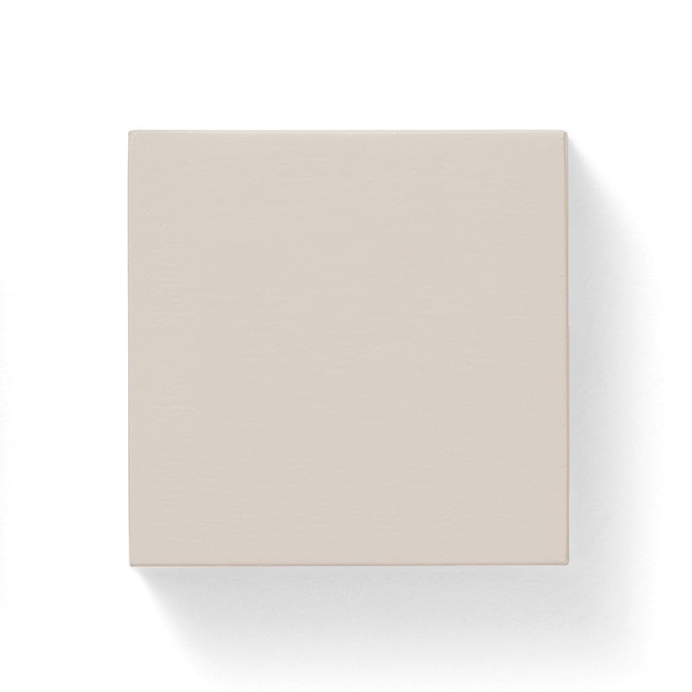
38. SUGAR SIFTER
SUGAR SIFTER is the sweetest of shades, buttery soft with a delicate rose tinted hue, it will envelop any room in a blanket of comfort.
View examples
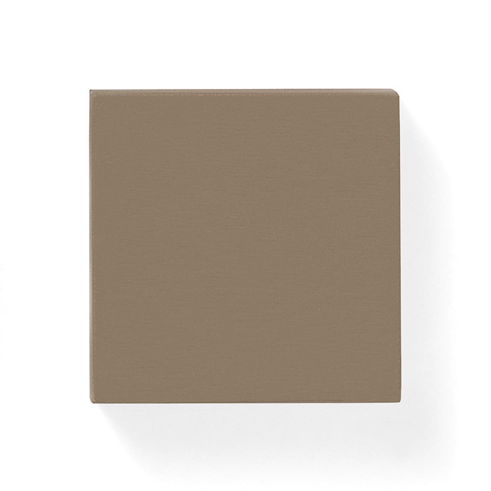
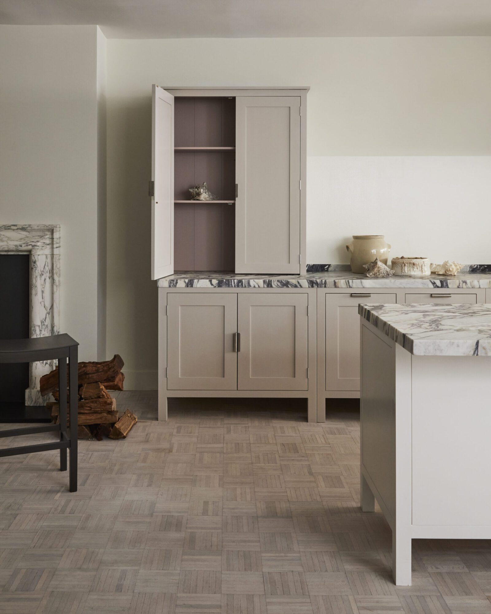
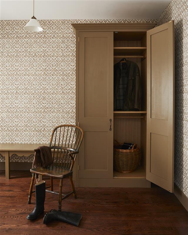
39. POTTERY MUG
Bernard Leach pottery inspired the elemental, muddy tones o f POTTERY MUG a deep, earthy drab, the perfect backdrop to set off the most delicate of details.
View examples
40. TIN CHEST
TIN CHEST is an intense, warm, thundercloud grey as solid and resilient as the material itself.
View examples
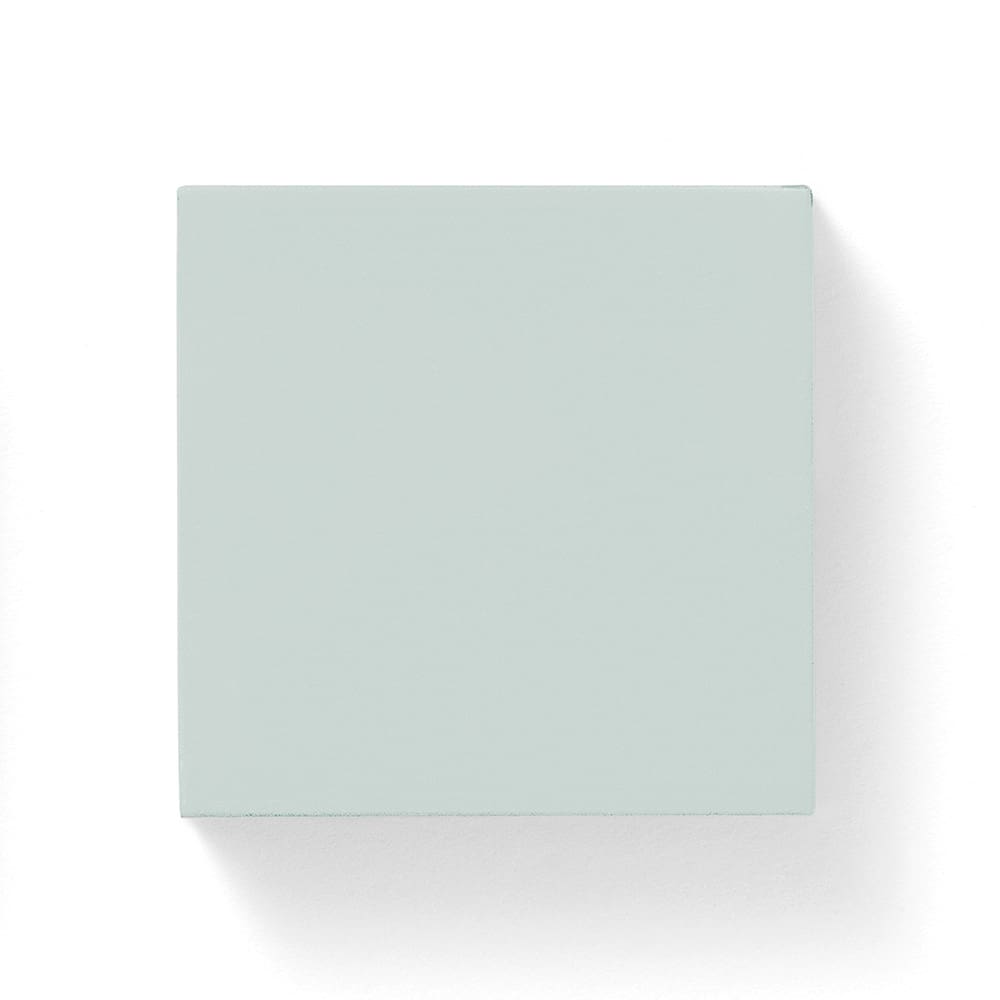
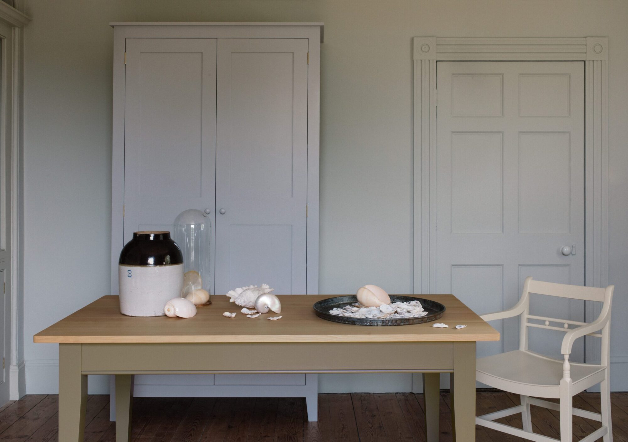
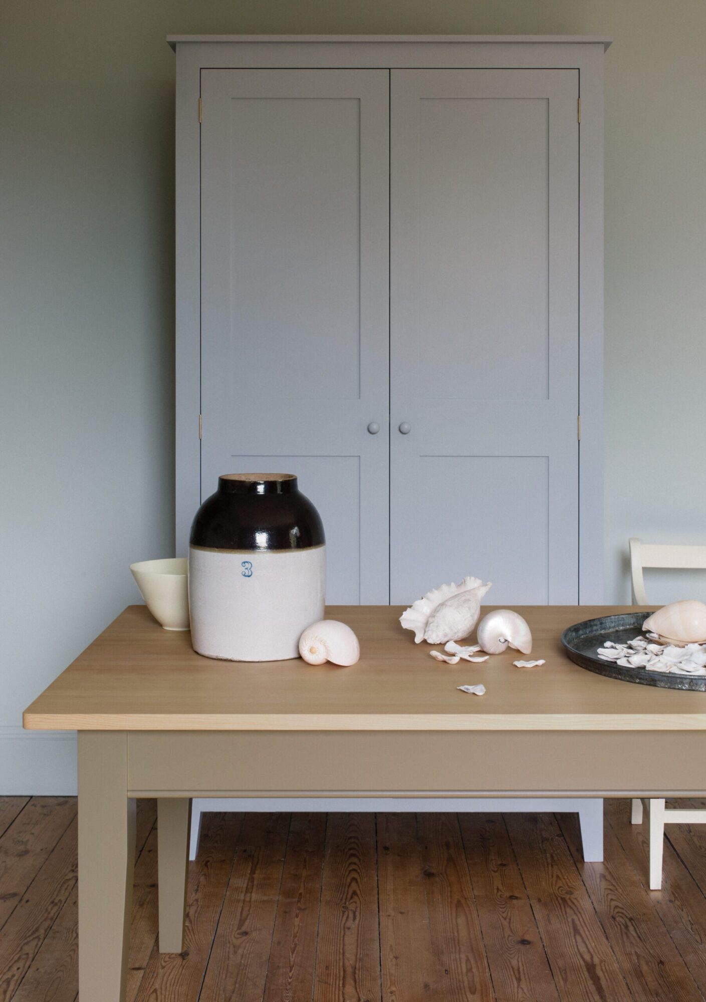
41. SLUB LINEN
This pleasing greyish, powdery blue SLUB LINEN, is evocative of a haze of flax against pale grey Suffolk sky.
View examples
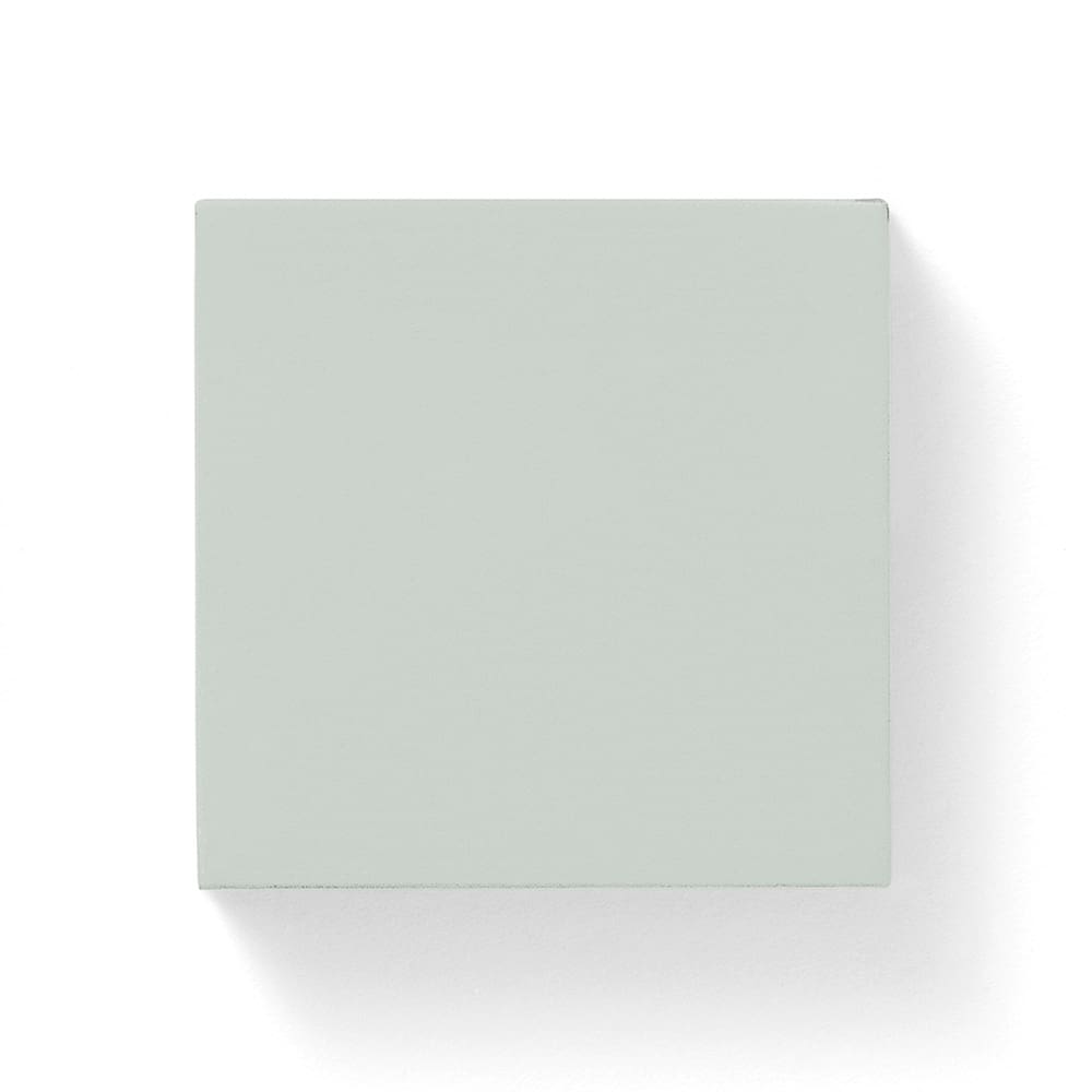
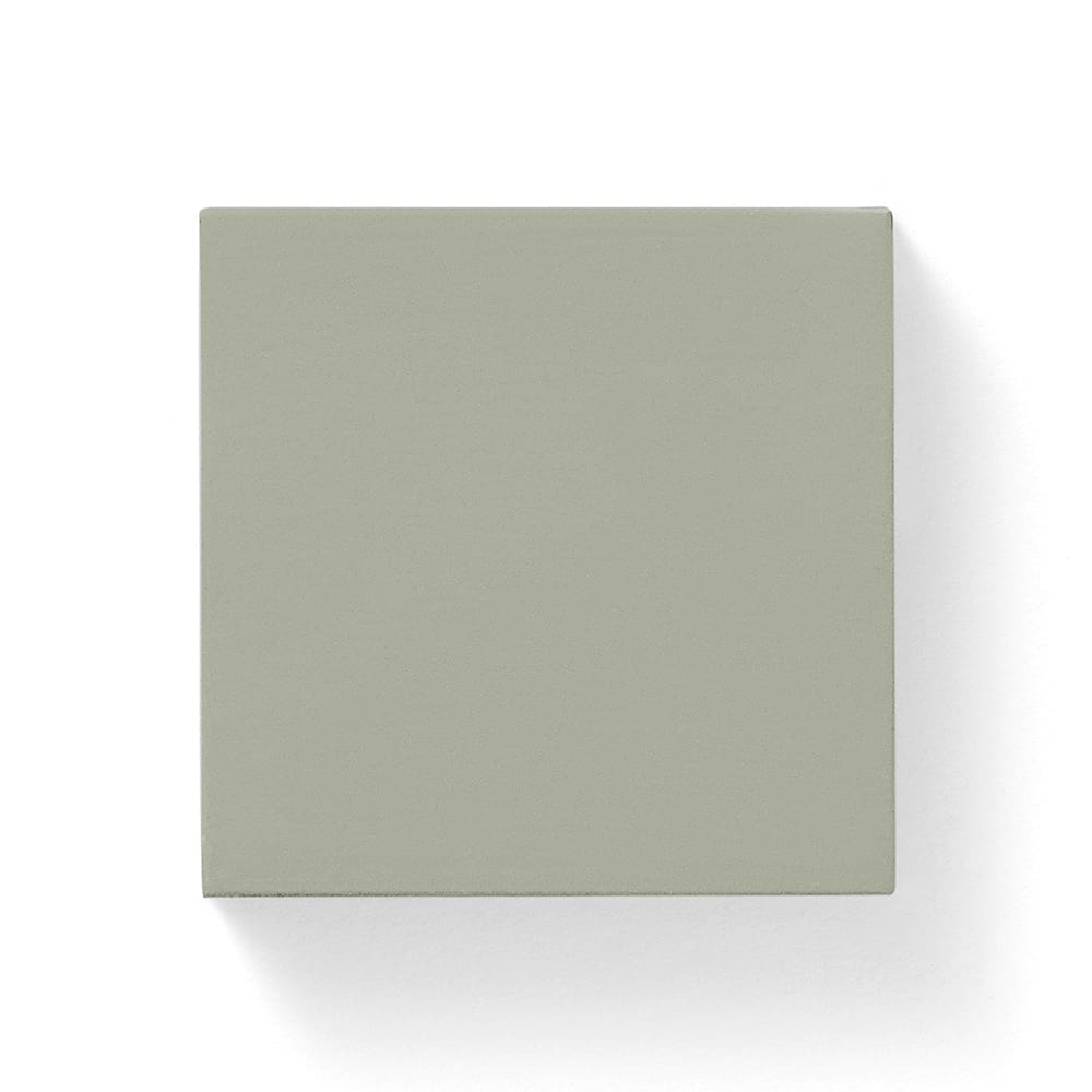
42. PEARL HANDLE
An enigmatic shade, PEARL HANDLE appears as a whisper of watery green and in another light a sublime silver haze, created in honour of the precious shell, prized for thousands of years.