
COLOUR COLLECTION No.6
Reflects the life and loves of co-founder and creative director Katie Fontana. Plain English was established in the heart of Suffolk and continues to be grounded in its cultural and rural traditions. Many of Katie’s creative influences derive from the materials, architecture and aesthetics of the villages and coastal towns of Suffolk, while others take root in her much-loved pastime of sailing on the dramatic wind whipped coast of Cornwall. This collection was put together by Kate Shaw and Katie Fontana.
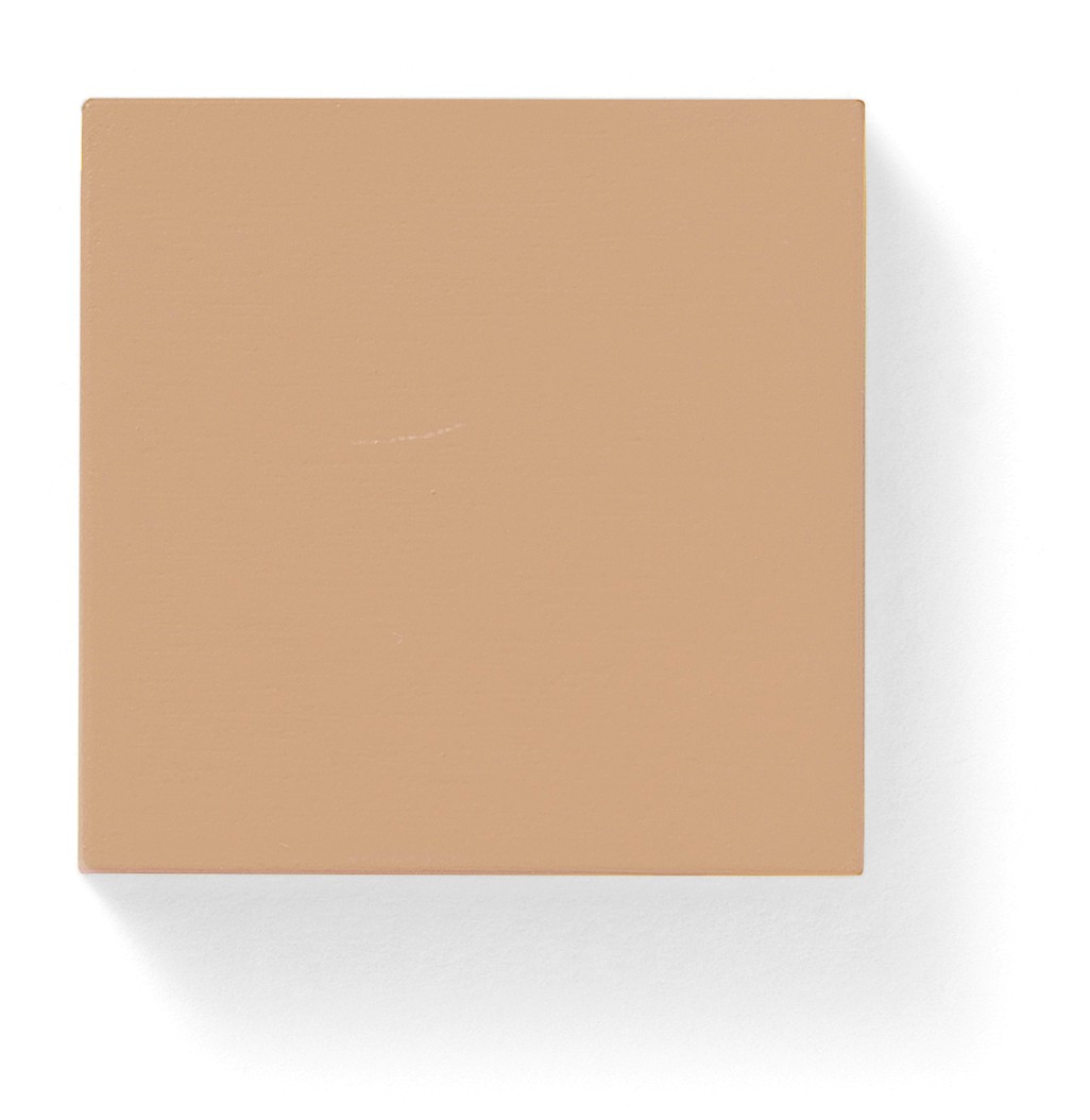
51. Lightning
Like loamy mortar, this warm neutral takes its name from Suffolk’s colloquial term for high-alumina cement
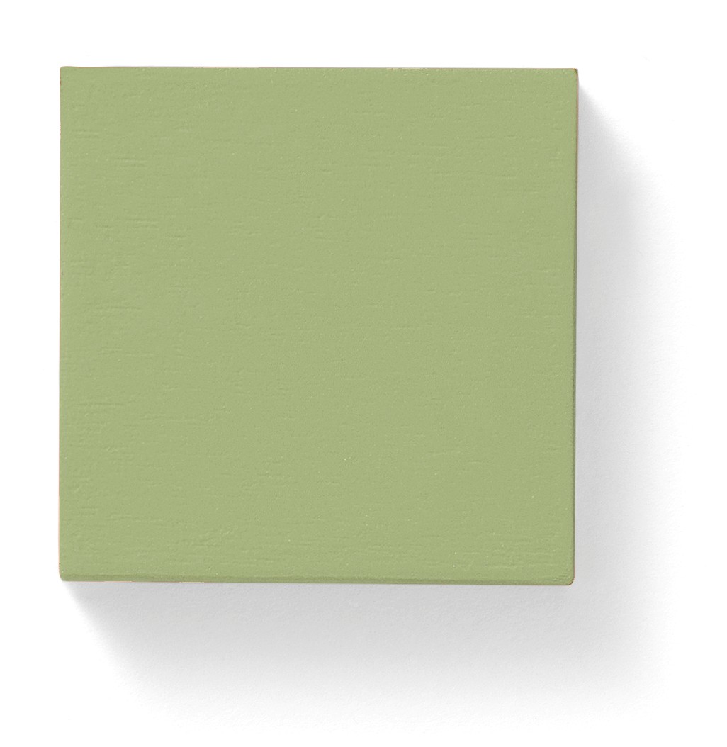
52. Sea Pea
A calming, vegetal green named for the wildflower that rambles along Suffolk’s shoreline
53. Pamment
A rich clay that pairs depth of Suffolk terracotta floor tiles with a sun-kissed brightness
54. Pilchard’s Back
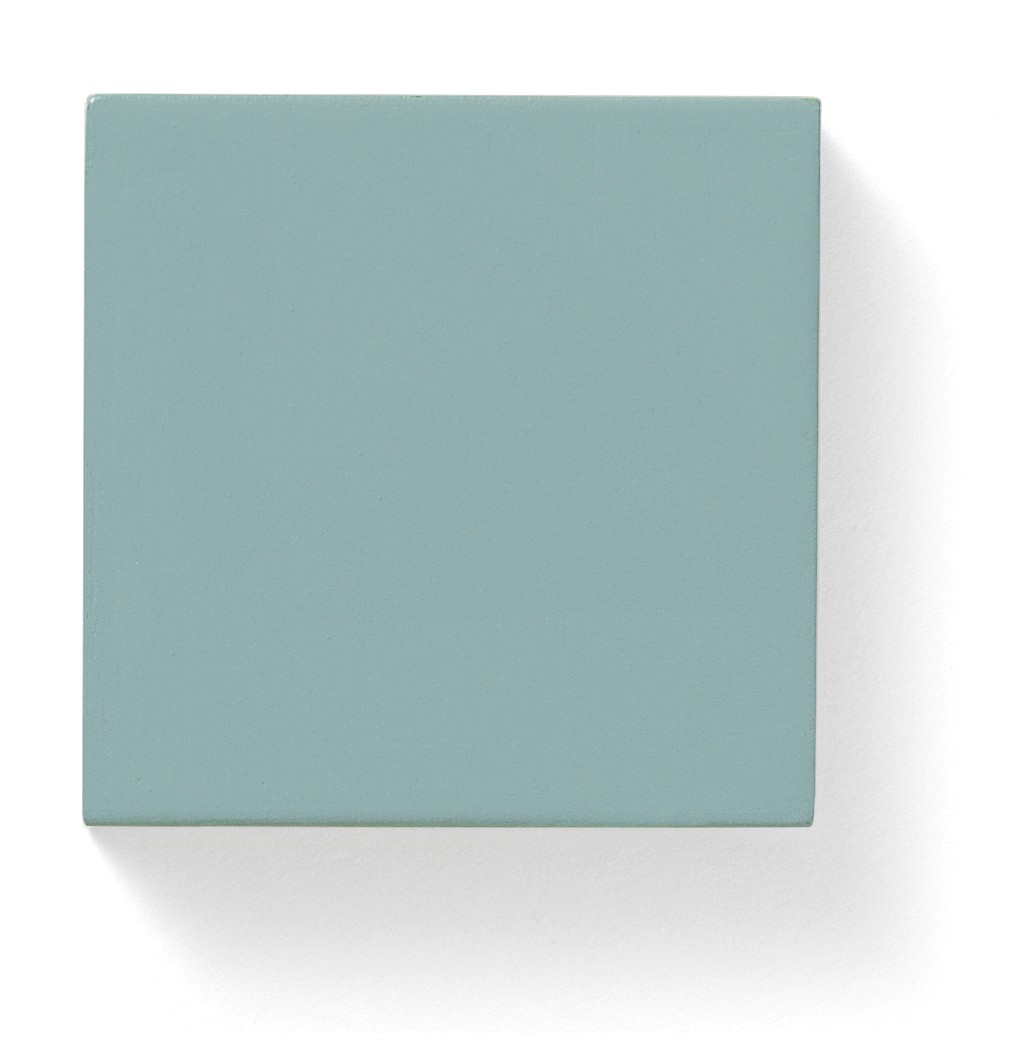
The lead-like greyish blue of one of Cornwall’s greatest traditional exports
55. Piskies Cove
The aquamarine of sun-sparkled shallows, with a touch of magic (a ‘pisky’ is mythical Cornish sprite)
56. Sailor’s Collar
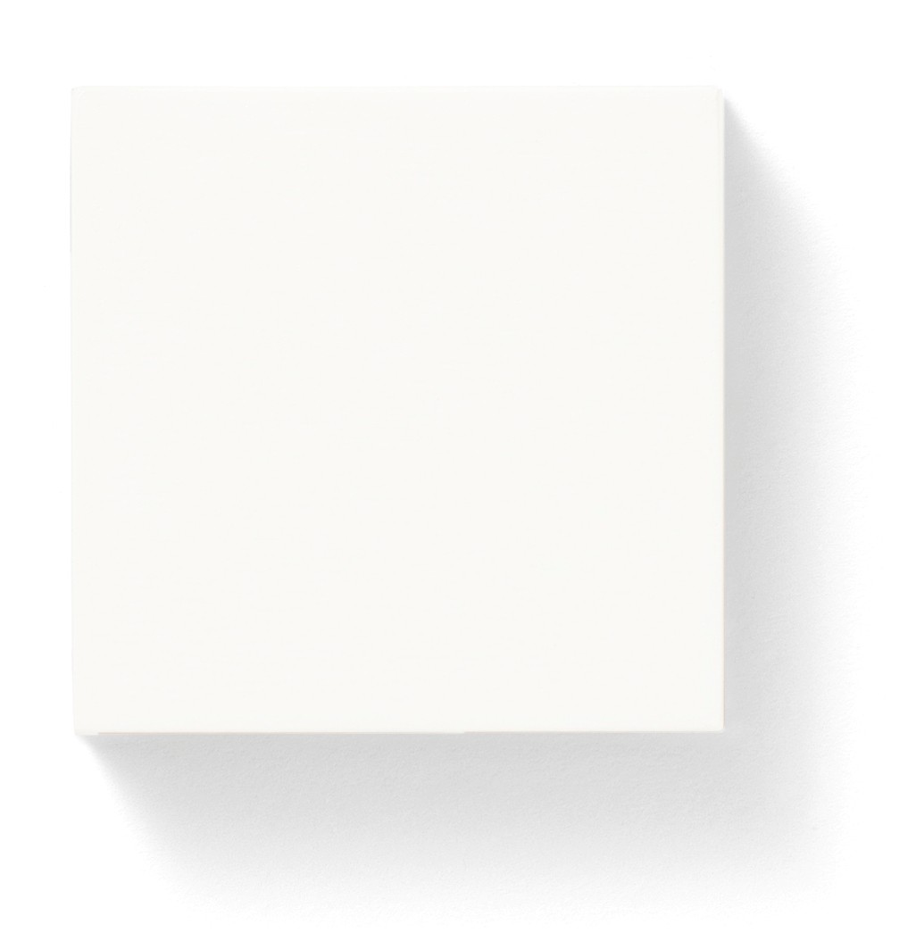
A maritime white, deepened a scintilla of lamp black, with all the briskness of starched cotton
57. Benton Duff
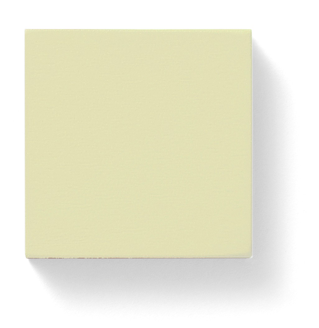
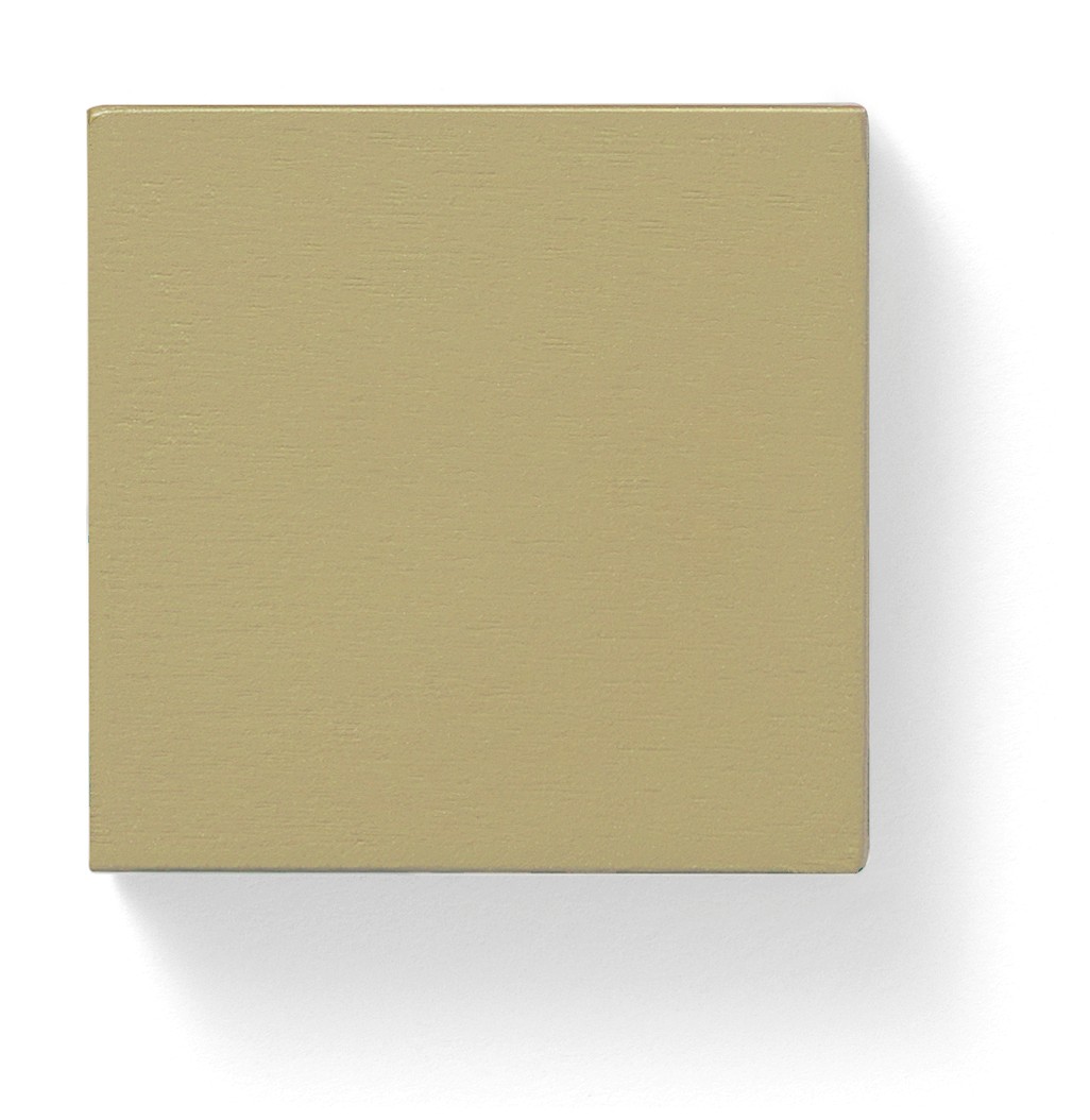
A powdery yellow, named for Cedric Morris’s often-painted and much-admired irises
58. Galoshes
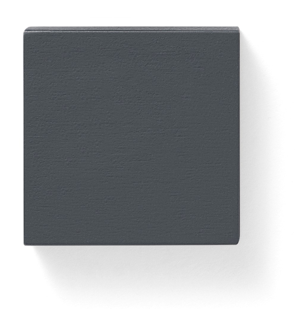
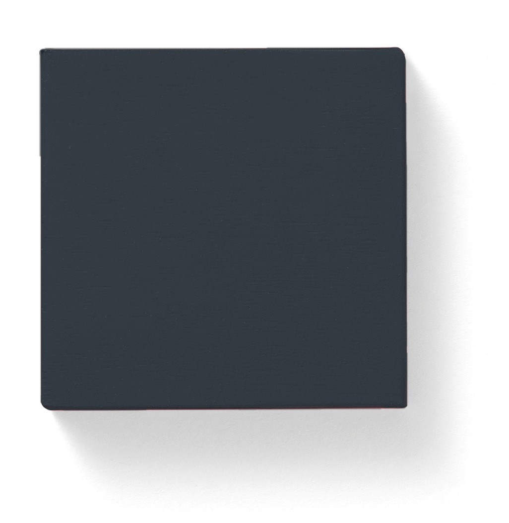
The dark blue-black of rubber overshoes for inclement weather (not to be confused with wellies…!)
59. Pie Dish
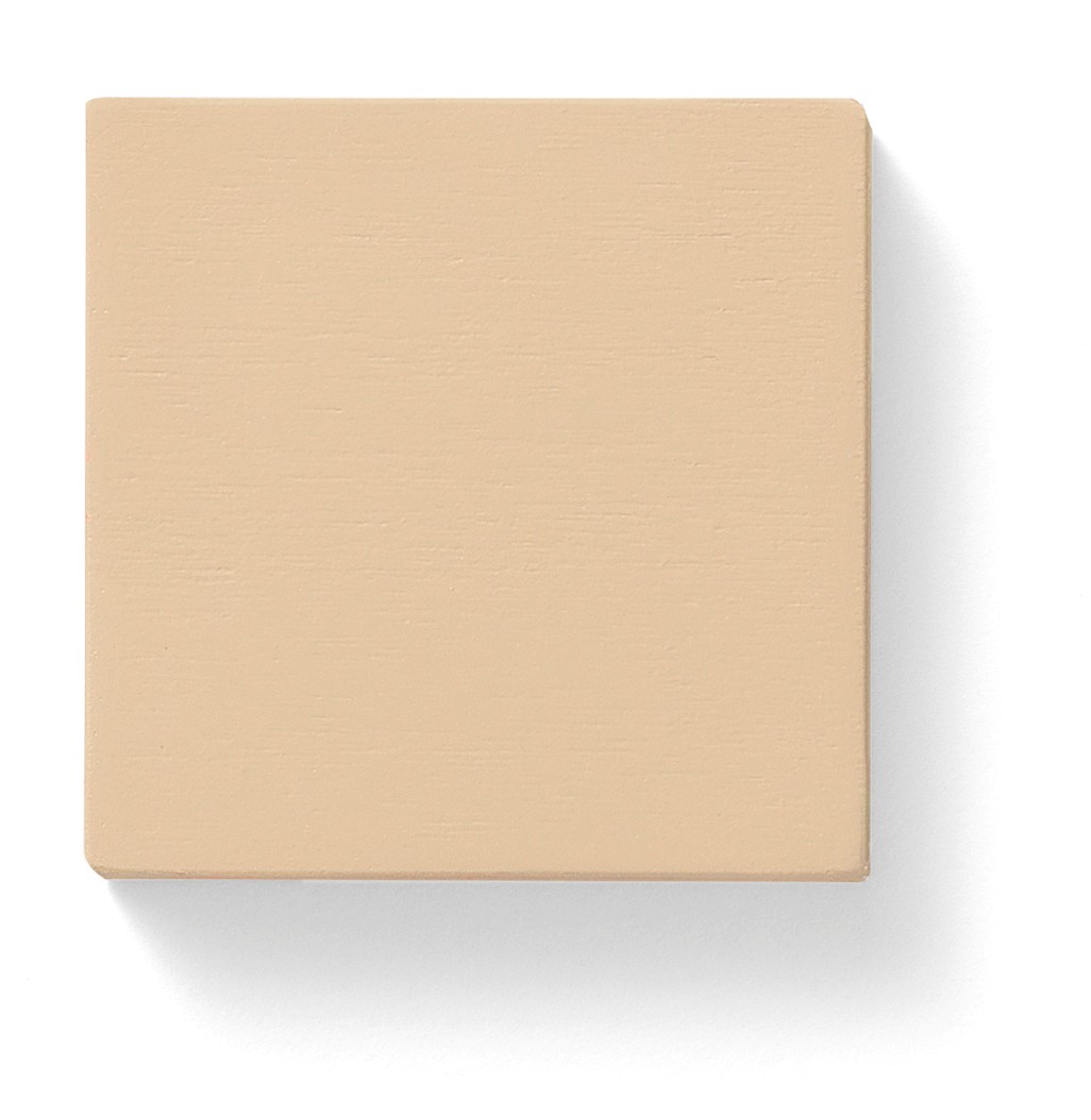
A deliciously darkened buff, which harks back to early 19th-century stoneware baking dishes
60. Shrimp Paste
A dusky pink that brings to mind seaside sandwiches during picnics of yesteryear